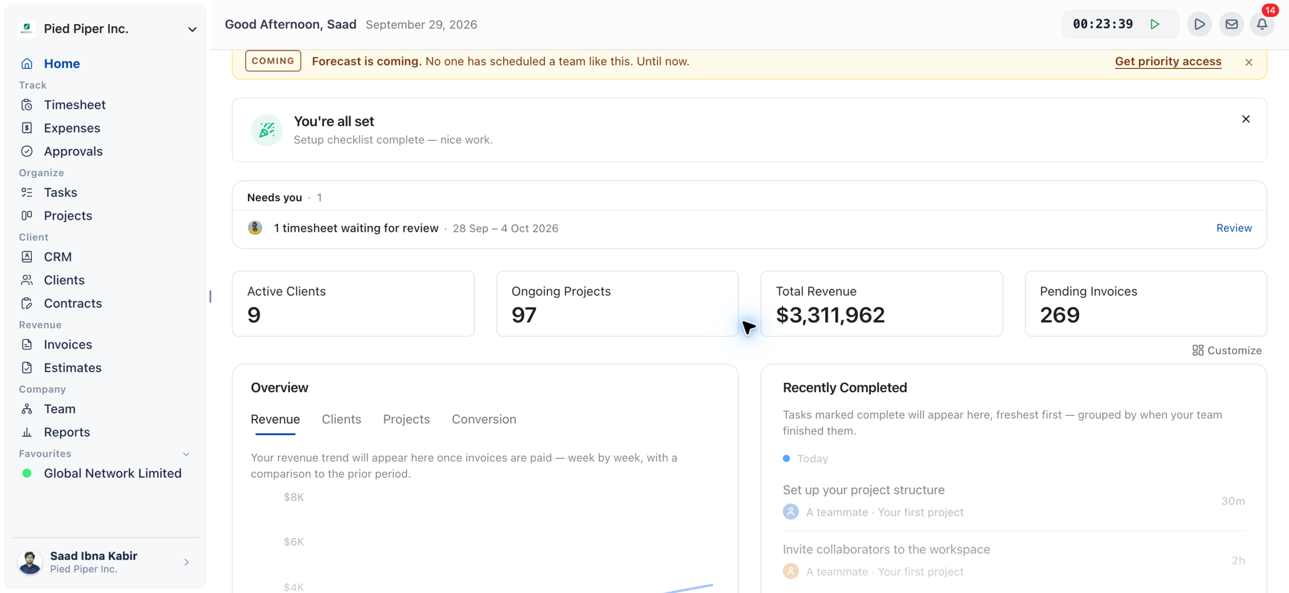
Running a digital agency means juggling clients, projects, cash flow, contracts, and deadlines all at once. Before OneSuite’s Dashboard, getting a clear picture of how your agency was doing meant jumping between invoices, project boards, CRM pipelines, and task lists.
The Dashboard changes that. It pulls every critical metric revenue, active projects, overdue tasks, pending invoices, pipeline opportunities, and unsigned documents into one screen. The moment you open OneSuite, you know exactly where your agency stands.
The Dashboard is designed for agency owners and team leads who need the full picture fast. Individual contributors will also find it useful for tracking their own tasks and upcoming deadlines
What the Dashboard Solves #
- No more tab-switching. Revenue, tasks, projects, and pipeline are in one place.
- Catch problems early. Overdue tasks, stalled deals, and unsigned contracts surface immediately.
- Start every day with context. Know what’s urgent before you open your inbox.
- Track growth over time. Revenue trend charts show whether you’re moving in the right direction.
Customizing Your Dashboard #
Your Dashboard is fully customizable. You can resize widgets, remove ones you don’t need, and add any widget back at any time. OneSuite remembers your layout between sessions.
Opening the Customize Panel #
Go to your Dashboard on the home screen after logging in.

Click the Customize button in the top-right corner of the screen.
A panel slides open showing all available widgets, both active and hidden.
Resizing a Widget Half Size vs. Full Size
Every widget can be displayed at half width or full width. Half-size widgets sit side by side. Full-size widgets span the entire page width.
Hover over any widget. A small toolbar appears in its top-right corner.
Click the resize icon(two arrows) to toggle between half-size and full-size.
Your layout saves automatically no Save button needed.
Tip
Use full-size for widgets you check constantly (Revenue Overview, My Tasks) and half-size for supporting context widgets (Top Clients, Pipeline Overview)
Removing a Widget #
Hover over the widget you want to remove.
Click the⋮ menu in the widget’s top-right corner.
Select Remove widget.
It disappears immediately and other widgets reflow to fill the space.

Adding a Widget Back #
Click Customize in the top-right corner of the Dashboard.
Find the widget you want to restore hidden widgets are listed in this panel.
Click Add next to the widget name. It appears at the bottom of your Dashboard.Drag it to your preferred position.
Reordering Widgets #
Click and hold any widget’s title bar, then drag it to a new position. Other widgets shift automatically to make room.
The Top Metric Card #
Across the very top of your Dashboard sit four summary cards giving you your agency’s headline numbers at a glance.

Active Clients
The total number of clients currently active in your workspace. A quick indicator of your current workload and client base size.
Ongoing Projects
All projects currently in progress across your team. Use this to sense-check capacity before taking on new work.
Total Revenue
Lifetime revenue from all paid invoices. This updates automatically every time a client pays an invoice in OneSuite
Pending Invoices
The number of invoices sent but not yet paid. A high number here means it’s time to follow up with clients.
How Digital Agencies Use OneSuite Dashboard to Manage Clients, Projects, and Revenue in One Place #
Dashboard Widgets Explained
Revenue Overview #
Shows your agency’s revenue week by week as a line chart, compared against the same period in the prior cycle. The solid line is the current period; the dashed line is the comparison.
Revenue trends tell a story, numbers alone can’t. A rising line means your invoicing and collections are working. A plateau or dip is an early signal to review your pipeline or chase outstanding invoices.
Revenue populates automatically once you have paid invoices. No setup needed.
Use the Last 30 days dropdown (bottom-right) to change the time range.
Switch between the Revenue,Clients,Projects, and Conversions for different breakdowns of the same period.
Click Send an invoice →to go straight to invoice creation.

Note:
The chart only reflects paid invoices, not sent or pending ones. If your chart looks empty, check that invoices have been marked as paid.
Revenue Forecast #
Has two tabs: Trend (monthly revenue vs. the same period six months ago) and Forecast (projected future revenue based on your pipeline and invoice patterns).
Forecasting is one of the hardest parts of running an agency. This widget gives you a data-backed projection so you can plan hiring, investment, and capacity well ahead of time.
Click the Forecast tab to switch from the trend view to the forward projection.
Use the Last 30 days filter to adjust the time range for the trend view.
Click Send an invoice →to add revenue that will appear in next month’s figures.

Recently Completed #
Shows tasks your team has marked complete, grouped by when they finished Today, Earlier, and by date for older completions. The most recent completions always appear at the top.
It’s easy to focus on what’s pending and miss celebrating what’s done. This widget gives you instant visibility into team momentum and helps you catch when project activity slows down.
Tasks marked complete in any project appear here automatically no extra action needed.
Each entry shows the task name, the team member who completed it, and the project it belongs to.Click View your projects →to open the full project board.

My Tasks #
Shows your personal task queue every task assigned to you, across all projects. Three tabs: Upcoming (due in the next 7 days), Overdue, and Completed.
Without a consolidated task view, it’s easy to miss a deadline buried in a specific project board. My Tasks surface everything that needs your attention, regardless of which project it lives in.
The Upcoming tab groups tasks by day Today, Tomorrow, then by day name for the rest of the week.
Click the circle to the left of a task to mark it complete directly from the Dashboard.
Click Add a task →to create a new task without leaving the Dashboard.Switch to Overdue to see everything past its due date clear these first.

Overdue Tasks Count & Age #
Shows the total number of tasks past their deadline, broken into four age buckets: Recent (1–3 days), A Week (4–7 days), Critical (8–14 days), and 2+ Weeks (15+ days).
The older a task gets, the harder it is to recover. The age breakdown lets you triage immediately tackle Critical and 2+ Weeks tasks before anything else, as those are most likely to affect client relationships.
Review this widget every morning as part of your daily planning.
A large number in the 2+ Weeks bucket often signals tasks that are blocked, not just delayed. Investigate before reassigning.
Click through to the relevant project to reassign, unblock, or close each task.

Upcoming Deadlines #
Lists projects with approaching deadlines, sorted by urgency. Projects past their deadline are flagged in red as Overdue.
Missing a project deadline damages client trust. Having upcoming deadlines visible on your Dashboard means you’re never surprised you can redistribute team resources before a deadline slips.
Each project shows the team members assigned, the lead, and the deadline date.
Red dates indicate overdue projects act on these first.
Click any project row to jump directly to that project’s board.

Most Active Projects #
Surfaces the projects with the most task activity recently, measured by the number of tasks updated. Shows the last-updated timestamp and team members involved.
Activity is a proxy for health. Projects that haven’t had updates in weeks may be stalled without anyone flagging it.
Use this widget to quickly spot where your team is spending the most time.
If a project that should be active isn’t appearing here, it may be blocked or deprioritized worth a conversation.
Click any project to open it directly.

Top Projects by Revenue #
Ranks your projects by revenue generated highest to lowest and shows each project’s percentage contribution to your total lifetime revenue.
Not all projects are equal. Knowing which ones drive the most revenue helps you decide where to deploy your best people and which service lines to double down on.
The list is sorted by revenue, highest first. The default timeframe is Lifetime.
Click the›arrow next to any project to open its detail page.
Watch the percentage figures if one project accounts for a disproportionate share, that’s a concentration risk worth addressing.

Top Clients by Revenue #
Ranks your clients by how much revenue they’ve contributed, showing each client’s percentage of total lifetime revenue and their number of associated projects.
Your highest-revenue clients deserve your best attention. This widget also helps you spot if you’re over-reliant on one client a common risk for growing agencies.
Review the list regularly to ensure top clients are receiving appropriate attention.
If any single client represents more than 30–40% of your revenue, consider diversifying your client base.Click the›arrow to open that client’s profile and review all associated projects and invoices.

Pipeline Overview #
Shows your CRM pipeline broken down by stage Qualification, Contacted, Proposal Sent, Won, Testimonial Given, and Lost with the total deal value at each stage.
A healthy pipeline is the lifeblood of an agency. The Pipeline Overview lets you spot imbalances immediately if everything is stuck at Qualification and nothing is reaching Proposal Sent, your conversion process needs attention.
Look for stages with large values that aren’t progressing. These opportunities deserve a personal review.
The total figure at the top is your entire active pipeline value.
Click any stage row to jump to the Opportunities view filtered by that stage.

Pipeline Growth #
Charts how your total pipeline value has changed over time whether your prospecting efforts are building momentum or new opportunities are drying up.
Revenue lags pipeline. If pipeline growth flatlines today, your revenue will feel it in 60–90 days. Monitoring this early gives you time to act before it hits your bottom line.

Recent Opportunities #
Shows newly added CRM opportunities, most recent first. Each entry shows the opportunity name, current stage, associated contact, deal value, and when it was created.
New opportunities need attention fast. The longer a lead sits untouched after entering your pipeline, the lower your chance of converting it.
Check this widget each morning to see if new leads came in overnight from your website, email, or team members.
Click any opportunity row to open it and add your next action.
Stage badges (like Contacted) show where each opportunity sits in your pipeline.

Stalled Opportunities #
Flags opportunities that haven’t had any activity for more than two weeks. When everything is moving, it shows a green “Every deal is fresh” message a satisfying signal that your pipeline is healthy.
Deals die from neglect, not rejection. Most lost opportunities were never formally lost they just went cold because no one followed up. This widget makes sure that never happens.
Any opportunity that appears here needs a follow-up today, not tomorrow.
Click View pipeline →to see the full list and take action.
If this widget consistently has entries, consider setting up Opportunity Automation reminders in your CRM settings.

Overdue CRM-Related Tasks #
Surfaces CRM tasks follow-ups, calls, proposals, check-ins that have passed their due date, sorted with the worst offenders at the top.
CRM tasks are promises you made to follow up. Missing them damages trust and costs you deals. Having them visible on your Dashboard means they can’t quietly disappear.
Each task shows the assignee, the associated opportunity or client, and how long ago it was due.
Click the›arrow to open the task and mark it done or reassign it.
If the same team member’s tasks repeatedly appear here, that’s a capacity conversation worth having.

Lead Source #
A donut chart showing where your opportunities come from SEO, Referral, Email Campaign, LinkedIn, Events, Website, and any custom sources you’ve added in CRM settings.
Knowing which channels generate your leads tells you where to invest your marketing dollars. If 80% of your opportunities come from referrals, doubling down on referral programs will grow your pipeline faster than ad spend.
Hover over each segment to see the count and percentage for that source.
If a large segment is labeled Other (no source), your team isn’t consistently tagging leads. Remind them to set the source when creating opportunities.
Review this data quarterly to guide your marketing channel allocation decisions.

Documents and Contracts #
Shows the current status of your sent documents proposals, contracts, agreements grouped by state: Sent, awaiting signature and Shared, not opened.
Unsigned contracts mean projects can’t officially start. Documents that haven’t been opened signal the client may have missed your email. This widget gives you the visibility to follow up at exactly the right moment.
Documents under Sent, awaiting signature have been opened but not signed. These clients have seen your proposal and they need a nudge.
Documents under Shared, not opened haven’t been viewed yet. Reach out to confirm the client received the link.Each entry shows who created the document and when it was sent. Click View all →to open the full Documents list.

Tip :
If a high-value contract has been in “Shared, not opened” for more than 48 hours, call the client directly your email may have gone to spam
Related Article :